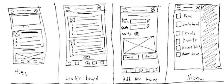
For this project, I had the role of designing, prototyping, and testing the application. The goal was to create an application to seamlessly record and share high scores with friends, family, & leaderboards. Our target audience would be frequent arcade goers around early teenage age to late 40s. Research indicated that there was no solid mobile application for recording arcade high-scores, making this an untapped market to attack. Below were the initial paper designs for the application.

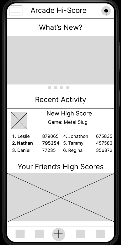
After this involved designing the digital wireframes so that we could begin user testing.

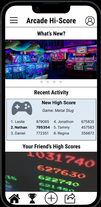
With the digital wireframes completed, we were able to start user testing and found that users needed more clarity on navigation, including a more recognizable icon for the profile page. With these changes implemented, we moved forward to the high-fidelity mockup.

With the final polished design, users found it very easy to navigate the application and even appreciated how it asked for you to share with people immediately after adding a high-score to the application.
In conclusion, from this design process I learned about the importance of iconography and the importance of clarity when it comes to navigation. I would like to keep testing with this application and possibly even approach some engineers to design this application to be used in the public.